LADY LAZARUS
THE STORY BEHIND THE NAME AND LABEL DESIGN
When we met with the local winemaker to discuss branding their signature wine for the mass-market, we knew we had a unique challenge ahead of us. The wine, a proprietary recipe with a distinctive sweet and sour taste, required a brand that would stand out and accurately represent its one-of-a-kind flavor profile. After sampling a few too many glasses and discussing the winemaker’s vision, we were inspired by Sylvia Plath’s poem “Lady Lazarus” and its themes of rebirth, transformation, and resilience.


The name “Lady Lazarus” perfectly captures the essence of the wine – a sweet and sour blend that is both complex and captivating. The poem’s themes of resilience and transformation resonated with us, as the wine represents a unique blend of flavors that come together to create something truly special.
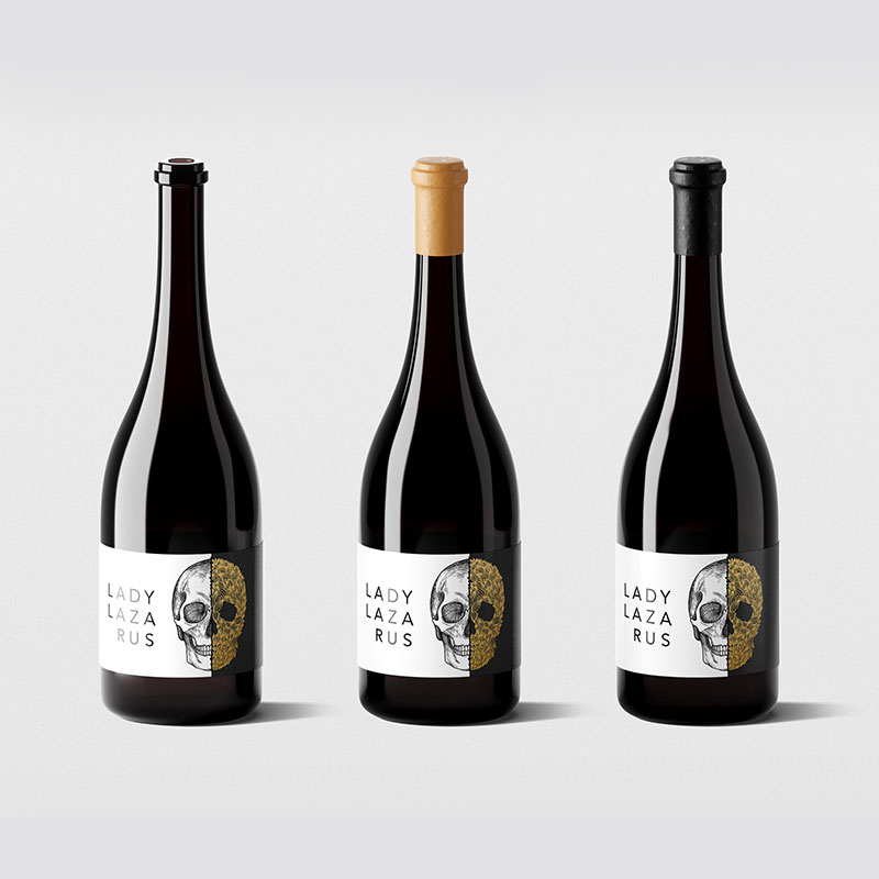
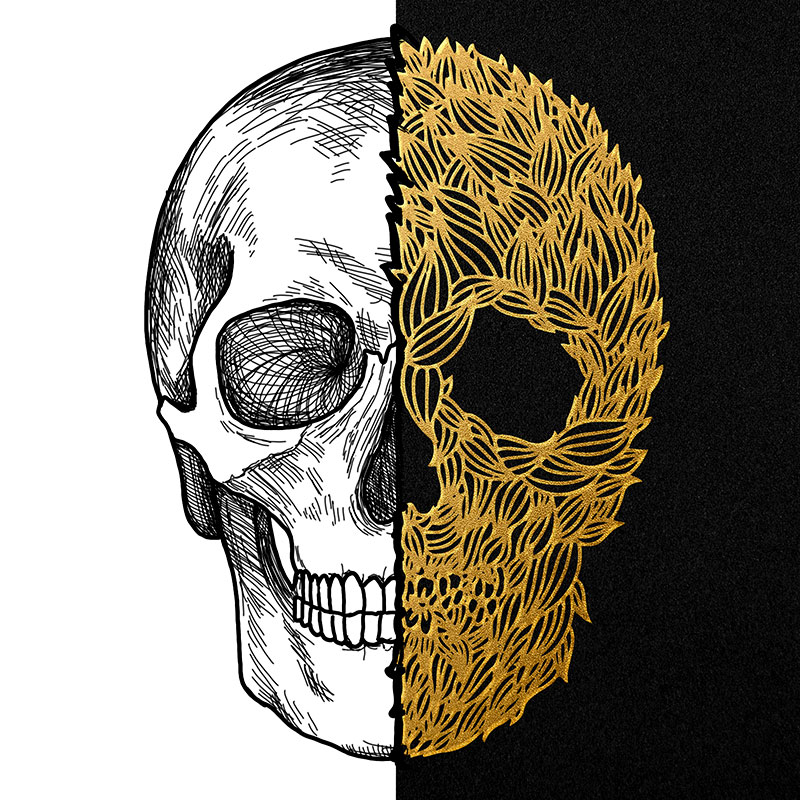
The label design brings the name to life, featuring a skull split down the middle – a black and white skull illustration on the left and gold foil leaves that create the shape of the right side of the skull. The design represents the duality of life and death, the sweet and sour notes of the wine, and the themes of rebirth and resilience found in the poem.
The left side of the label, featuring the black and white skull illustration, represents the darker, more intense flavors of the wine. The right side of the label, featuring the gold foil leaves, represents the brighter, more delicate notes of the wine.
The label design is both striking and memorable, capturing the essence of the wine and the themes of the poem. The name and label design of Lady Lazarus Wine perfectly represent the unique blend of flavors and sultry moods, making it a brand that stands out and accurately represents the wine’s one-of-a-kind taste.
